May 23rd, 2018
By Steve Hanke.
The Grim Reaper has taken his scythe to the Iranian rial (see chart below). The Islamic Republic of Iran remains in the ever-tightening grip of an economic death spiral. The economy is ever-vulnerable because of problems created by the last Shah, and added to massively by the theocratic regime. Indeed, the economy is more vulnerable to both internal and external shocks than ever. That vulnerability will become more apparent in the face of President Trump’s tearing up of the Joint Comprehensive Plan of Action (JCPOA), and the laying on of more primary and secondary sanctions against Iran. How fast the death spiral will spin is anyone’s guess.

The most important price in an economy is the exchange rate between the local currency and the world’s reserve currency — the U.S. dollar. In Iran, the IRR/USD exchange rate, represents the most important price. By using active and available black-market (read: free market) data for the Iranian rial, I have transformed the black-market exchange rate into accurate measurements of country wide inflation. The economic principle ofPurchasing Power Parity (PPP) allows for this reliable transformation, so long as the annual inflation rate exceeds 25%.
The chart below shows how Iran’s implied annual inflation rate has surged to an annual rate of 75.8% with the collapse of the rial’s value against the U.S. dollar. Indeed inflation has spiked in 2018.

So, what is to come of Iran’s economic death spiral? It can be summed up in one word: misery.
To get a sense of how miserable Iran is, we can look to Hanke’s Annual Misery Index. Back in February when the index was calculated, Iran ranked the 11th most miserable country, out of the 98 countries in the index. Using today’s surging inflation rate of 75.8% in our calculation of misery, Iran would a rank 3rd, just behind Venezuela and Syria.
Without meaningful reform in Iran, more of the same will be expected for its economy and the rial. In the words of George W. Bush, “this sucker could go down.”
Comments Off on The Iranian Rial’s Economic Death Spiral
January 23rd, 2017
By Steve Hanke.

In what follows, I update my annual Misery Index calculations. A Misery Index was first constructed by economist Art Okun as a way to provide President Lyndon Johnson with a snapshot of the economy.
The original Misery Index was just a simple sum of a nation’s annual inflation rate and its unemployment rate. The Misery Index has been modified several times, first by Robert Barro of Harvard and then by myself. My modified Misery Index is the sum of the unemployment, inflation, and bank lending rates, minus the percentage change in real GDP per capita. A higher Misery Index score reflects higher levels of “misery,” and it’s a simple enough metric that a busy president without time for extensive economic briefings can understand at a glance.
Below is the 2016 Misery Index table. For consistency and comparability, all data come from the Economist Intelligence Unit (EIU).

Venezuela holds the inglorious spot of most miserable country for 2016, as it did in 2015. The failures of the socialist, corrupt petroleum state have been well documented over the past year, including when Venezuela became the 57th instance of hyperinflation in the world.
Argentina holds down the second most miserable rank, and the reasons aren’t too hard to uncover. After the socialist Kirchner years, Argentina is transitioning away from the economy-wracking Kirchner policies, but many problematic residues can still be found in Argentina’s underlying economic framework.
Brazil, at number 3, is a hotbed of corruption and incompetence, as the recent impeachment of Brazilian President Dilma Rousseff indicates. It’s similar in South Africa, at number 4, where corruption runs to the very highest office. President Zuma of South Africa just recently survived impeachment after the Constitutional Court unanimously decided that Zuma failed to uphold the country’s constitution.
Egypt, ranked fifth most miserable, is mired in exchange controls, a thriving Egyptian pound black market, and military-socialist rule. However, Egypt is likely suffering even more than this table indicates, as the EIU’s inflation estimate for Egypt (17.8 percent) is far off from the Johns Hopkins-Cato Institute Troubled Currencies Project, which I direct, estimate of 150.7 percent.
Next, with a Misery Index score of 36.0, is Ukraine, a country still feeling the effects of the highly-publicized civil war that began three years ago. With a civil war and endemic corruption, it comes as a shock to no one that Ukrainians are miserable?
Azerbaijan is plagued by corruption, fraud, and incompetence, and currency devaluations are commonplace – the manat has been devalued twice since 2015, losing 57 percent of its value against the dollar. This weakness in the currency markets makes it difficult to do business, and the Azerbaijani economy has faltered as a result.
Turkey faces a despotic leader in Islamist Erdogan, who devotes all of his resources to staying in power rather than governing the state, leading to a strongly depreciating currency and a populous mired in fear. The Turkish lira has lost over 24 percent of its value against the dollar in the last year, and the economy is in the process of spontaneously dollarizing. Not surprisingly, Turkey is a member of the Fragile Five, which also include Brazil, India, Indonesia, and South Africa.
The reasons for Iran’s rank on this list are almost too obvious and plentiful to enumerate, but it’s safe to say that a combination of corruption, incompetence, theocratic-authoritarian rule, and more have led to its state of misery.
Rounding out the ten most miserable countries is Colombia. The Colombian government has been so preoccupied negotiating peace talks with the rebel FARC group that the economy has been neglected, causing interest rates to spike as the economy stands still.
On the other end of the table one finds Japan with the low score of 0.4. Japan’s low misery is not the result of high GDP per capita growth (Japan’s figure is only 0.7 percent), unlike most other countries at the bottom. Instead, it’s Japan’s -3.5 percent inflation rate that drives the score down. China is the next best, with the second-least miserable score of 4.5, almost entirely due to its high (6.3 percent) GDP per capita growth rate.
Also of note on this list is the United States. In President Obama’s final year in office, the United States ranked lower than Slovakia, Romania, Hungary, China, and even Vietnam. What a legacy.
Comments Off on The World’s Most – And Least – Miserable Countries in 2016
January 8th, 2017
Donald Trump has tabbed Andy Puzder to lead the Department of Labor. Puzder is the CEO of CKE, the restaurant outfit (read: Hardee’s and Carl’s Jr.). CKE, thanks to Puzder saving it from the bankruptcy hammer, employs 75,000 workers (read: jobs). Puzder knows that “high” minimum wages, such as the $15 per hour one thrown around by progressives, is a job killer for those with poor job skills.
During his nomination hearings, Andy Puzder will no doubt be grilled about his views on “high” minimum wages. His inquisitors will trot out glowing claims about the wonders of a $15 per hour minimum wage, as did President Obama in his 2014 State of the Union address. As the President put it: “It’s good for the economy; it’s good for America.” Not so fast.
The glowing claims about minimum wage laws don’t pass the most basic economic smell tests. Just look at the data from Europe. The following two charts tell the tale and should be tucked into Andy Puzder’s briefing portfolio.
There are six European Union (E.U.) countries in which no minimum wage is mandated (Austria, Cyprus, Denmark, Finland, Italy, and Sweden). If we compare the levels of unemployment in these countries with E.U. countries that impose a minimum wage, the results are clear. A minimum wage leads to higher levels of unemployment. In the 21 countries with a minimum wage, the average country has an unemployment rate of 11.8%. Whereas, the average unemployment rate in the seven countries without mandated minimum wages is about one third lower — at 7.9%.

This point is even more pronounced when we look at rates of unemployment among the E.U.’s youth — defined as those younger than 25 years of age.

In the twenty-two E.U. countries where there are minimum wage laws, 27.7% of the youth demographic — more than one in four young adults — was unemployed in 2012. This is considerably higher than the youth unemployment rate in the seven E.U. countries without minimum wage laws — 19.5% in 2012 — a gap that has only widened since the Lehman Brothers collapse in 2008.
So, minimum wage laws — while advertised under the banner of social justice — do not live up to the claims made by those who tout them. They do not lift low wage earners to a so-called “social minimum”. Indeed, minimum wage laws — imposed at the levels employed in Europe — push a considerable number of people into unemployment. And, unless those newly unemployed qualify for government assistance (read: welfare), they will sink below, or further below, the social minimum.
As Nobelist Milton Friedman correctly quipped, “A minimum wage law is, in reality, a law that makes it illegal for an employer to hire a person with limited skills.”
Comments Off on Two Minimum Wage Charts for Andy Puzder
December 13th, 2016
By Steve Hanke.
Venezuela’s inflation has officially become the 57th official, verified episode of hyperinflation and been added to the Hanke-Krus World Hyperinflation Table, which is printed in the authoritative Routledge Handbook of Major Events in Economic History (2013). An episode of hyperinflation occurs when the monthly inflation rate exceeds 50 percent for 30 consecutive days. Venezuela’s monthly inflation rate first exceeded 50 percent on November 3rd and continues to do so, sitting at 131 percent as of December 11, 2016. The peak monthly inflation rate thus far was 221 percent, which is relatively low in the context of hyperinflations. This and more is documented in detail in the linked paper, which I co-authored with Charles Bushnell, “Venezuela Enters the Record Book: The 57th Entry in the Hanke-Krus World Hyperinflation Table,” newly published in the Johns Hopkins Institute for Applied Economics, Global Health, and the Study of Business Enterprise Studies in Applied Economics working paper series.
The Hanke-Krus World Hyperinflation Table and a chart of Venezuela’s monthly inflation rate are reproduced below. Sources for the Hanke-Krus World Hyperinflation Table are at the bottom.


Hanke-Krus World Hyperinflation Table Notes and Sources
– When a country experiences periods of hyperinflation that are broken up by 12 or more consecutive months with a monthly inflation rate below 50%, the periods are defined as separate episodes of hyperinflation.
– The currency listed in the chart is the one that, in a particular location, is associated with the highest monthly rate of inflation. The currency may not have been the only one that was in circulation, in that location, during the episode.
– We are aware of one other likely case of hyperinflation: North Korea. We reached this conclusion after calculating inflation rates using data from the foreign exchange black market, and also by observing changes in the price of rice. Based on our estimates, this episode of hyperinflation most likely occurred from December 2009 to mid- January 2011. Using black-market exchange-rate data, and calculations based on purchasing power parity, we determined that the North Korean hyperinflation peaked in early March 2010, with a monthly rate of 496% (implying a 6.13% daily inflation rate and a price-doubling time of 11.8 days). When we used rice price data, we calculated the peak month to be mid-January 2010, with a monthly rate of 348% (implying a 5.12% daily inflation rate and a price-doubling time of 14.1 days). All of these data were obtained August 13, 2012 from Daily NK, an online newspaper that focuses on issues relating to North Korea
Comments Off on Venezuela Enters the Record Book, Officially Hyperinflates
December 6th, 2016
By Steve Hanke.
Economic policy is subject to fads and fashions. The most recent economic-policy fad is public infrastructure. Its advocates include progressives on the “left” — like President Obama, Hillary Clinton, and Bernie Sanders — and populists on the “right” — like President-elect Trump. They tell us to take the chains off fiscal austerity and spend — spend a lot — on public works. They allege that this elixir will cure many, if not all, of our economic ills. Let’s take a look at their arguments and evidence.
Economic growth remains muted throughout the world. The U.S. provides an important example. It has been over eight years since Lehman Brothers collapsed and the Great Recession commenced. But, the U.S. has failed to bounce back. The economy is still struggling to escape from a growth recession — a recession in which the economy is growing, but growing below its trend rate of growth. The U.S. aggregate demand, which is best represented by final sales to domestic purchasers (FSDP), is only growing in nominal terms at a 2.75 percent rate (see the accompanying chart). This rate is well below the trend rate of 4.73 percent.

Many argue that fiscal “austerity” is the culprit that has kept growth tamped down. They advocate fiscal stimulus (read: spending on public works).
Another line of argument used to support massive increases in spending on public works goes beyond the standard Keynesian counter-cyclical argument. It is the secular-stagnation argument. Its leading advocate is Harvard Economist, Larry Summers, formerly U.S. Treasury Secretary and President of Harvard. He argues that private enterprise is failing to invest, and that, with weak private investment, the government must step up to the plate and spend on public works.
For evidence to support Summers’ secular-stagnation argument, he points to anemic private domestic capital expenditures in the U.S. As the accompanying chart shows, net private domestic business investment (gross investment — capital consumption) is relatively weak and has been on a downward course for decades.

Investment is what fuels productivity. So, with little fuel, we should expect weak productivity numbers in the U.S. Sure enough, the rate of growth in productivity is weak and has been trending downward. The U.S. is in the grips of the longest slide in productivity growth since the late 1970s. The secular stagnationists assert that the “deficiency” in net private investment and the resulting productivity slump can be made up by public works spending.
Both the counter-cyclical and the secular-stagnation arguments have been trotted out many times in the past. So, it’s old wine in new bottles. But, it seems to be selling as a means to escape fiscal austerity. If proposed public works projects proceed as projected, the government financing magnitudes would be stunning. The McKinsey Global Institute estimates that annual spending of $3.7 trillion per year from 2013 through 2030 would be “required” worldwide.
McKinsey’s “requirements” estimate was computed by using the 70 percent rule of thumb. As shown in the accompanying chart, the average value of the stock of infrastructure for representative countries is 70 percent of GDP. Based on this value, McKinsey then calculated the amount of spending required to keep the global infrastructure stock to GDP ratio fixed at 70 percent over the 2013-2030 period. That exercise yielded a whopping total of $67 trillion in public works spending, which is in the ballpark of most other estimates.

President-elect Trump has jumped on this infrastructure bandwagon. He is proposing a $1 trillion public works program. Following the script of the public works advocates (read: big spenders), Trump has lifted a page from President Obama’s Council of Economic Advisers (CEA). The President’s CEA’s 2016 Annual Report contains a long chapter titled “The Economic Benefits of Investing in U.S. Infrastructure.” That title alone tells us a great deal. Infrastructure spending advocates focus on the alleged benefits, which are often wildly inflated, while ignoring, downplaying, or distorting the cost estimates.
This was clearly on display in an op-ed, “These are the Policies to Restore Growth to America,” which appeared in the Financial Times (12-13 November 2016). It was penned by Anthony Scaramucci, a prominent adviser of President-elect Trump. In it, Scaramucci asserted that infrastructure spending “has an estimated economic multiplier effect of 1.6 times, meaning Mr Trump’s plan would have a net reductive effect on long-term deficits.” This multiplier analysis is exactly the same one used by President Obama’s CEA to justify public works spending. The idea that a dollar of government spending creates more than a dollar’s worth of output is nothing new. Indeed, the multiplier originated in an article that appeared in a 1931 issue of the Economic Journal. The article was written by R. F. Kahn, who was one of John Maynard Keynes’ favorite students and closest collaborators. Since Kahn’s 1931 article, the multiplier has become an inherent part of Keynesian theory. The numerical values of the multiplier are not only sensitive to the assumptions employed, but also subject to misuse in the artificial inflation of benefits.
Once public works are installed, the hot air comes out of their alleged benefits. These projects are poorly maintained, and users are often not charged for what they use, or they are charged prices set well below the relevant costs incurred. Water is a classic case. For example, the accompanying chart shows that, on average, 34 percent of the water delivered to water systems is either stolen or leaks out of the distribution systems. In Nigeria, 70 percent is leaked or stolen. So, it’s hard to take seriously the claims that billions of dollars are required to develop more water-resource capacity when much of the water produced in existing systems leaks away. Adjusted for leaks and thefts, the alleged benefits for many new projects, which have been inflated by multipliers, wither away to almost nothing.

When we turn to the cost side of the ledger, something infrastructure advocates prefer to keep from the public’s view, we find that infrastructure projects are always subject to cost overruns. While the projects might look good on paper, reality is a different story. Detailed studies show that the average ratios of actual costs to estimated costs for public works projects in the U.S. typically range from 1.25 to over 2.0.
In addition to cost overruns, the financing of infrastructure requires the imposition of taxes, and taxes impose costs beyond the amount of revenue raised. The excess burdens of taxation include “deadweight” distortions and enforcement and compliance costs. In short, it costs more than a dollar to finance a dollar in government spending. The best estimates indicate that, on average, it costs between $1.50 to $1.60 to raise a dollar in tax revenue.
Taking proper account of cost overruns and the costs of collecting taxes, one wonders if there are any public works projects that could justify federal financing, let alone financing to the tune of $1 trillion. Welcome to the wonderful world of infrastructure waste, fraud, and abuse.
Comments Off on Public Infrastructure — Welcome to the World of Waste, Fraud, and Abuse
November 28th, 2016
By Steve H. Hanke.
The United States has recorded a trade deficit in each year since 1975. This is not surprising. After all, we spend more than we save, and this deficit is financed via a virtually unlimited U.S. line of credit with the rest of the world. In short, foreigners in countries that save more than they spend (read: record trade surpluses) ship the U.S. funds to finance America’s insatiable spending appetites.
Japan and more recently China have been the primary creditors for the savings-deficient U.S. And since their exports are largely manufactured goods, the real counterpart of their buildup of dollar claims on Americans is for them to run export surpluses in manufactured goods with the U.S. The accompanying chart shows the contribution of Japan and China to the U.S. trade deficit since the late 70s.

So, the U.S. savings deficiency has contributed to the hollowing out of American manufacturing. But, you wouldn’t know it by listening to President-elect Trump. He never mentions America’s savings deficiency. Instead, he claims that American manufacturing has been eaten alive by foreigners who use unfair trade practices and manipulate their currencies to artificially weak levels. This is nonsense.
To get a handle on why the President-elect Trump – and many others in Washington, including the newly-elected Senate Minority Leader Charles Schumer – are so misguided and dangerous, let’s take a look at Japan. From the early 1970s until 1995, Japan was America’s economic enemy. The mercantilists in Washington asserted that unfair Japanese trading practices caused the trade deficit and destroyed U.S. manufacturing. Washington also asserted that, if the yen appreciated against the dollar, America’s problems would be solved.
Washington even tried to convince Tokyo that an ever-appreciating yen would be good for Japan. Unfortunately, the Japanese caved into U.S. pressure, and the yen appreciated, moving from 360 to the greenback in 1971 to 80 in 1995. This massive yen appreciation didn’t put a dent in Japan’s exports to the U.S., with Japan contributing more than any other country to the U.S. trade deficit until 2000 (see the accompanying chart).
In April 1995, Secretary of the Treasury Robert Rubin belatedly realized that the yen’s great appreciation was causing the Japanese economy to sink into a deflationary quagmire. In consequence, the U.S. stopped bashing the Japanese government about the value of the yen, and Secretary Rubin began to evoke his now-famous strong-dollar mantra. But while this policy switch was welcomed, it was too late. Even today, Japan continues to suffer from the mess created by the yen’s appreciation.
Now, China is America’s economic enemy, and China bashing is in vogue. Indeed, hardly a day goes by without President-elect Trump railing against China, accusing it of unfair trade practices and currency manipulation. He is also threatening to impose huge tariffs on the Middle Kingdom.
At the same time, President-elect Trump is promising a set of spending and taxing policies that will cause the gap between our spending and savings to widen. This will balloon our trade deficit. And with that, Mr. Trump will, no doubt, point an accusatory finger and start a trade war with China, a country that currently contributes 48% to the U.S. trade deficit. So, the President-elect’s promised lax fiscal policies might just get us into a trade war with one of the most important countries in the world.
Comments Off on Why Trump’s Policies Will Probably Result in a Trade War with China
October 30th, 2016
By Steve Hanke.

Stability might not be everything, but everything is nothing without stability.
At a monetary conference in Vienna back in 2014, the distinguished Frenchman, friend, and occasional collaborator Jacques de Larosière proclaimed that the current world monetary order should be termed an “anti-system.” He has a point — an important point. Among other things, such an anti-system invites an enormous amount of instability, as well as uninformed loose talk that influences public opinion and policy.
The Chinese yuan has been at the center of much of the recent misinformation and disinformation about currencies. During the first presidential debate between Donald Trump and Hillary Clinton, Trump fingered China as the world’s best practitioner of currency devaluations — devaluations that Trump claims power China’s exports. Clinton didn’t object to Trump’s thesis. Indeed, she boarded the same train.
The facts are that Chinese exports have steadily risen since 1995, but they have not been powered by a depreciating yuan. In fact, the yuan has slightly appreciated in both nominal and real terms. The accompanying chart tells that story.

So, what was said about the yuan during the debate is untrue. But, that yuan story is not a debate slip. It is disinformation spread by unions, mercantilist of all stripes, and politicians: Republicans and Democrats alike.
Shortly after the first presidential debate, the yuan entered the International Monetary Fund’s Special Drawing Right (SDR) basket of top-tier currencies. With that, the Chinese boasted that the yuan was now in the same league as the other SDR currencies: USD, euro, Japanese yen, and the British pound. As part of China’s yuan promotion campaign, it declared that the yuan would be a serious challenger to the greenback as the world’s premier currency. While the yuan’s international use has grown rapidly, it started with a base of zero.
The dollar is King, and when it comes to currencies, Kings are difficult to dethrone. Even after the introduction of the euro in 1999, the USD has maintained its top spot as the currency held as official reserves, accounting for 63 percent of the total. When it comes to foreign exchange trading, the dollar is even more dominant, accounting for almost 88 percent of the turnover. Dollar notes are widely used internationally, too, with as much as two-thirds of all the greenbacks in circulation circulating overseas. In terms of the transactions handled by the Society for Worldwide Interbank Financial Telecommunication (SWIFT), the outfit that moves “money” among banks, the U.S. dollar has increased its dominance over the past few years, accounting for almost 52 percent of the total transactions (see the accompanying chart).

As with the introduction of the euro, claims that the yuan will dethrone the King are off the mark. For the past three millennia, there has always been a dominant world currency, and it’s very hard to challenge the King. This is evidenced by the longevity of dominant currencies. On average, they’ve reigned for 300 years. This would suggest that the U.S. dollar, unless the U.S. government makes a big mistake or a new disruption technology enters the stage, is probably going to be on the throne a while longer. Why?
To answer that question, we borrow from the work of Nobelist Robert Mundell. In Mundell’s study of the world’s dominant currencies over the past three millennia, he found that there was always one currency that dominated, and that the following five characteristics were associated with each dominant currency:
- The transactions domain was large. On this score, the U.S. clearly qualifies. Until recently, it has been the world’s largest economy measured on a purchasing power parity basis. Today, its GDP accounts for 16.1 percent of the world’s total. China has recently surpassed the U.S. on that measure, with 16.9 percent of the total, and the Eurozone has 11.9 percent. So, in terms of their transaction zones, both the yuan and the euro could challenge the greenback.
- Monetary policy inspired confidence. No currency ever survived as a top international currency with a high rate of inflation or with a recurring risk of debasement or devaluation. So, unless there are significant U.S. monetary policy mistakes, challengers will face a Sisyphean task.
- Exchange controls were absent. Exchange controls, such as those in China, are always a sign of weakness, not strength. Controls alone eliminate the Chinese yuan as a challenger to the greenback’s dominance. This explains why China is working to remove controls. It is worth stressing that one of the areas where the U.S. dollar is becoming increasingly vulnerable to a challenge is the area of sanctions (read: restrictions), which the U.S. government imposes on the use of the greenback. Financial sanctions – which have been inspired by an aggressive, interventionist, neoconservative philosophy – are used by the U.S. and are administered as weapons of war by the Office of Foreign Asset Control at the U.S. Treasury (OFAC). Paradoxically, the OFAC is waging war on the U.S. dollar. Gone are the days when George Washington, in the middle of the U.S. Revolutionary War, could draw on his account at the Bank of England.
Related to exchange controls are other types of restrictions that can be placed on how people can spend and transfer the money they own. One way to restrict the use of a modern currency is to abolish it. That is just what Harvard Professor Kenneth Rogoff has proposed in his new book The Curse of Cash, which was recently published by Princeton University Press. And Rogoff is not alone. Another Harvard Professor, former U.S. Treasury Secretary Larry Summers, and Prof. Narayana Kocherlakota, who was formerly the president of the Federal Reserve Bank of Minneapolis, have also advocated moving away from greenback cash. Such a move would open the gates for a challenge to King dollar.
- Strong international currencies have always been linked to strong states. States that can defend themselves against external and internal enemies. This is a security-stability factor.
- Until the world entered the age of complete fiat currencies, all the dominant currencies had a fallback factor. They were all convertible into gold or silver. So, today’s currencies, being fiat currencies, have no fallback factor, and all are vulnerable to a challenge. Perhaps a new disruptive technology will allow for the production and efficient use of a private currency with a fallback factor. Such a currency, if deemed to be legal, could mount a challenge to the King.
When viewing the twists and turns of the greenback in Jacque de Larosière’s anti-system, there is no better place to start than the Great Crash of 2008. The accompanying chart shows that the USD/€ exchange rate — the world’s most important price — fell a stunning 19.13 percent over a brief four month period. Linked to the soaring dollar, two other important prices, gold and oil, collapsed by 19.08 and 57.03 percent, respectively. Not surprisingly, the annual inflation rate in the U.S. moved from an alarming rate of 5.5 percent in July to an outright deflation of -1.96 percent a year later. Contrary to the Federal Reserve’s claims, the dance of the dollar and related changes in commodity prices and the level of inflation indicated that monetary policy was way too tight in late 2008. This caused massive instability that we still haven’t fully recovered from.

What can be done to reduce the instability in the current anti-system and mitigate the damage caused by the twists and turns of King dollar? The world’s two most important currencies — the dollar and the euro — should, via formal agreement, trade in a zone ($1.20 – $1.40 to the euro, for example). The European Central Bank would be obliged to maintain this zone of stability by defending a weak dollar via dollar purchases. Likewise, the Fed would be obliged to defend a weak euro by purchasing euros. Just what would have happened under such a system (counterfactually) since the introduction of the euro in 1999 is depicted in the accompanying chart.
Stability might not be everything, but everything is nothing without stability.

Comments Off on The Twists and Turns of the Greenback
October 25th, 2016
By Steve Hanke.
The International Monetary Fund (I.M.F.) was unsuccessful in covering up its nefarious activities in Greece, as WikiLeaks uncovered back in April. Later, the I.M.F.’s internal watchdog team released a report condemning the I.M.F.’s actions. But, in typical I.M.F. fashion, “before the report was published over the summer, fund officials demanded that the watchdog unit tamp down and in some cases remove sections of the report that said the I.M.F. was not releasing documents that evaluators sought,” Landon Thomas Jr. of the New York Times writes. However, the Fund’s cover-ups have been more successful in the past.
On August 14, 1997, shortly after the Thai baht collapsed on July 2nd, Indonesia floated the rupiah. This prompted Stanley Fischer, then Deputy Managing Director of the I.M.F., to proclaim that “the management of the I.M.F. welcomes the timely decision of the Indonesian authorities. The floating of the Rupiah, in combination with Indonesia’s strong fundamentals, supported by prudent fiscal and monetary policies, will allow its economy to continue its impressive economic performance of the last several years.”
Contrary to the I.M.F.’s expectations, the rupiah did not float on a sea of tranquility. It plunged from 2,700 rupiahs per U.S. dollar at the time of the float to lows of nearly 16,000 in 1998. Indonesia was caught up in the maelstrom of the Asian crisis.
By late January 1998, President Suharto realized that the I.M.F. medicine was not working and sought a second opinion. In February, I was invited to offer that opinion and began to operate as Suharto’s Special Counselor. After many discussions with the President, I prescribed the following antidote: an orthodox currency board in which the rupiah would be fully convertible into the U.S. dollar at a fixed exchange rate and would be fully backed by U.S. dollar reserves. On the day that news hit the street, the rupiah soared by 28 percent against the U.S. dollar on both the spot and forward markets. These developments infuriated the I.M.F., as well as the U.S. government.
Ruthless attacks on the currency board idea and me ensued. Suharto was told in no uncertain terms – by both the President of the United States, Bill Clinton, and then Managing Director of the I.M.F., Michel Camdessus – that he would have to drop the currency board idea or forego $43 billion in foreign assistance.
Economists jumped on the bandwagon, too. Every half-truth and non-truth imaginable was trotted out against the currency board idea. For me, those oft-repeated canards were outweighed by the full support for an Indonesian currency board (which received very little press) by four Nobel Laureates in Economics: Gary Becker, Milton Friedman, Merton Miller, and Robert Mundell. In addition, Margaret Thatcher’s economic guru, Sir Alan Walters, weighed in in support of the CBS idea. He not only supported it, but, on good intelligence, he warned me that the I.M.F. and the Clinton Administration were going to mount a defamation campaign, which they did.
Why all the fuss over a currency board for Indonesia? Merton Miller understood the great game immediately. He wrote to me when Mrs. Hanke and I were in residence at the Shangri-La Hotel in Jakarta, saying the Clinton administration’s objection to the currency board was “not that it wouldn’t work but that it would, and if it worked, they would be stuck with Suharto.” Much the same argument was articulated by Australia’s former Prime Minister Paul Keating: “The United States Treasury quite deliberately used the economic collapse as a means of bringing about the ouster of President Suharto.” Former U.S. Secretary of State Lawrence Eagleburger weighed in with a similar diagnosis: “We were fairly clever in that we supported the I.M.F. as it overthrew (Suharto). Whether that was a wise way to proceed is another question. I’m not saying Mr. Suharto should have stayed, but I kind of wish he had left on terms other than because the I.M.F. pushed him out.” Even Michel Camdessus could not find fault with these assessments. On the occasion of his retirement, he proudly proclaimed: “We created the conditions that obliged President Suharto to leave his job.”
Thanks to the official spinners at the I.M.F., setting the record straight has proven to be a Sisyphean task. Indeed, the spinners have been busy as little bees rewriting monetary history to cover up the I.M.F.’s mistakes and lies. To this end, the I.M.F. issued a 139-page working paper “Indonesia: Anatomy of a Banking Crisis: Two Years of Living Dangerously 1997–99” in 2001. The authors whitewash the currency board episode asserting, among other things, that I counseled President Suharto to set the rupiah-dollar exchange rate at 5,000. This pseudoscholarly account, which includes 115 footnotes, fails to document that assertion because it simply cannot be done. That official I.M.F. version of events also noticeably avoids referencing any of my published works or interviews based on my Indonesian experience, including an extensive International Herald Tribune interview, “Steve Hanke: Voice of Suharto’s Guru,” (March 20, 1998) in which I contradict the 5,000 rupiah to U.S. dollar fabrication.
That episode and its manipulations are not unique in the political world. It is useful, though, after time and events unfold, to set facts straight in order to understand the situation then and now. From that point of view, WikiLeaks is clearly engaged in a public service activity.
Comments Off on The IMF Should Have Been Mothballed and Put in a Museum, Long Ago
September 28th, 2016
By Steve Hanke.
Productivity and economic growth continue to surprise on the downside in most countries. While there is a great deal of handwringing over the so-called productivity puzzle, little attention is given to the real elixir: freer markets and more competition. Indeed, the policy tide is moving in the opposite direction in most places.
With an appeal to the facts, the productivity puzzle is easy to solve. Just slash regulations by mimicking best practices.
To get a grip on the productivity puzzle, let’s lift a page from the late Senator Daniel Patrick Moynihan, who once said, “You’re entitled to your own opinions, but you’re not entitled to your own facts.” Yes. There is nothing better than a hard look at empirical evidence to see if it supports those who espouse freer markets or those who embrace the regulatory state as models to enhance our prosperity and health.
The World Bank has been rigorously measuring the ease of doing business (DB) in many countries for over ten years, producing a treasure trove of empirical evidence. The Bank publishes its results identifying levels of economic freedom (read: regulatory freedom) each year in a volume entitledDoing Business. Ten sets of indicators that capture important dimensions of an economy’s regulatory environment are quantified. The accompanying table defines each of the ten quantitative indicators. These are each measured by using standardized procedures that ensure comparability and replicability across the 189 countries studied. For each indicator, the scores range from a potential low of ‘0’ to a high of ‘100’.

Using the DB scores, we can determine whether there is a relationship between a freer regulatory environment (a high DB score) and prosperity as measured by GDP per capita. The accompanying chart shows that there is a strong, positive relationship between DB scores and prosperity. For example, the United States’ DB score is 82.15 and its GDP per capita is $55,836, while Indonesia’s DB score is only 58.12 and its GDP per capita is $3,346. All the remaining 187 countries are plotted on the chart. There are only four countries that are “outliers”, with outsized GDP per capita relative to their DB scores: Qatar, Luxembourg, Switzerland, and Norway.

In addition to the strong, positive relationship between regulatory freedom (ease of doing business) and prosperity (GDP per capita), deregulation yields increasing returns. That is, each increment increase in the DB score yield larger and larger gains in GDP per capita. With each improvement in the DB score, there is a more-than-proportionate improvement in prosperity. This explains why post-communist countries that embraced Big Bang economic liberalizations, like Poland, have done so much better than the gradualists. The Big Bangers literally got more for their buck.
Economic prosperity is, quite literally, a matter of life and death. The relation between income growth and life expectancy is, of course, complex. Economic prosperity affects life expectancy through many channels: higher individual and national incomes produce favorable effects on nutrition, on standards of housing and sanitation, and on health and education expenditures. While it is true that reductions in mortality have sometimes been the result of “technological” factors, in the larger sense, it is clear that sustained economic growth is a precondition for the kinds of investments and innovations that, over time, significantly reduce mortality. The evidence on this point is abundant and unequivocal.
So, knowing that a freer regulatory environment is associated with higher levels of GDP per capita, we should observe that a freer regulatory environment (a higher DB score) is associated with higher life expectancies. Sure enough, it is. The accompanying chart shows a strong and positive relationship between DB scores and life expectancy — albeit one characterized by diminishing returns (given additional increments in DB scores yield smaller and smaller gains in life expectancy.)

Many of the 189 countries reviewed in the Doing Business 2016 report are far away from adopting “best practice” policies when it comes to the regulatory frameworks they impose on businesses. In consequence, prosperity and health are inferior to what they could be. Just how can that be changed? The easiest way is the simplest: just mimic what is done where “best practice” policies prevail. This is an old, tried-and-true technique that is used in industry, particularly when competitive markets prevail. Just copy what the “good guys” do. If you do so, you will become productive and competitive. These lessons about the diffusion of “best practice” and how it improves productivity are documented in great detail in a most insightful book by William W. Lewis: The Power of Productivity. Chicago: University of Chicago Press, 2004. The same strategy can be used by governments to slash regulations.
For example, until 2009, those seeking to import and sell pharmaceuticals in the Republic of Georgia faced the same regulatory review process as one would if the drugs were produced domestically. Applicants would pay a registration fee and file a two-part form with the Departmental Registry of State Regulation of Medical Activities at the Ministry of Labor, Health, and Social Protection. The subsequent review involved both expense and delay, with a fair amount of back-and forth between applicant and bureaucracy as technical examinations led to agency demands for corrections. This process was not intended to exceed about six months, but often took far longer. In addition, the government required all importers to obtain trade licenses from foreign manufacturers, adding to their costs.
In October 2009, however, the Georgian government did something remarkable. Recognizing that its regulatory machinery was, in fact, unnecessarily duplicating that in many developed countries, it adopted a new “approval regime.” It compiled a list of foreign authorities with good regulatory track records (including, for example, the European Medicines Agency and drug administrations in the United States, Japan, Australia, and New Zealand), and pharmaceuticals that were approved for sale by those entities could henceforth gain automatic approval for sale in Georgia. In addition, the registration fee was slashed 80 percent for brand name drugs and packaging regulations were greatly simplified under a new “reporting regime.”
This regulatory outsourcing compressed the time and greatly reduced the expense required to compete in the Georgian pharmaceutical market. The hope was that this would put significant downward pressure on prices and improve access to drug therapies in the domestic market. It did so very quickly. (These results are documented in Steve H. Hanke, Stephen J.K. Walters, and Alexander B. Rose. “How to Make Medicine Safe and Cheap.” Regulation, Fall 2014.)
To grasp the huge potential for increasing productivity, prosperity, and health, let’s look at Indonesia. The accompanying table shows Indonesia’s DB score for each of the ten indicators. Each is compared to the score of the country with the best DB score in that indicator. For example, Indonesia has a deplorable score on enforcing contracts. Indeed, the gap between Indonesia and Singapore, which scores the best on that indicator in the 189 countries studied, is huge. So, the potential improvement for Indonesia by adopting the best practice for enforcing contracts is enormous.

Just what overall improvements in Indonesia’s regulatory regime would do for prosperity is displayed in the last table relating incremental DB score improvement to GDP per capita. Indonesia’s current score is 58 and its GDP per capita is $3,346. So, if Indonesia attempts to slash its regulations and move closer to best practice — let’s say it improved its DB score by 10 points, yielding a score of 68 (the same as Greece and Serbia) — Indonesia’s GDP per capita would be expected to jump by $4,999, or 2.5 times.

With an appeal to the facts, the productivity puzzle is easy to solve. Just slash regulations by mimicking observed best practices.
Comments Off on Enhance Prosperity and Improve Health: Slash Regulations, Please
September 17th, 2016
By Steve Hanke.
A big story to come out of the last G-20 summit was that the Russians and Saudis were talking oil (read: an oil cooperation agreement). With that, everyone asked, again, where are oil prices headed? To answer that question, one has to have a model – a way of thinking about the problem. In this case, my starting point is Roy W. Jastram’s classic study, The Golden Constant: The English and American Experience 1560-2007. In that work, Jastram finds that gold maintains its purchasing power over long periods of time, with the prices of other commodities adapting to the price of gold.
Taking a lead from Jastram, let’s use the price of gold as a long-term benchmark for the price of oil. The idea being that, if the price of oil changes dramatically, the oil-gold price ratio will change and move away from its long-term value. Forces will then be set in motion to shift supply of and demand for oil. In consequence, the price of oil will change and the long-term oil-gold price ratio will be reestablished. Via this process, the oil-gold ratio will revert, with changes in the price of oil doing most of the work.
For example, if the price of oil slumps, the oil-gold price ratio will collapse. In consequence, exploration for and development of oil reserves will become less attractive and marginal production will become uneconomic. In addition to the forces squeezing the supply side of the market, low prices will give the demand side a boost. These supply-demand dynamics will, over time, move oil prices and the oil-gold price ratio up. This is what’s behind the old adage, there is nothing like low prices to cure low prices.
We begin our analysis of the current situation by calculating the oil-gold price ratios for each month. For example, as of September 5th, oil was trading at $46.97/bbl and gold was at $1323.50/oz. So, the oil-gold price ratio was 0.035. In June 2014, when oil was at its highs, trading at $107.26/bbl and gold was at $1314.82/oz, the oil-gold price ratio was 0.082.
We can calculate these ratios over time. Those ratios are presented in the accompanying chart, starting in 1973 (the post-Bretton Woods period).

Two things stand out in the histogram: the recent oil price collapse was extreme – the February 2016 oil-gold price ratio is way to the left of the distribution, with less than one percent of the distribution to its left. The second observation is that the ratio is slowly reverting to the mean, with a September 2016 ratio approaching 0.04.
But, how long will it take for the ratio to mean revert? My calculations (based on post-1973 data) are that a 50 percent reversion of the ratio will occur in 13.7 months. This translates into a price per barrel of WTI of $60 by March 2017 – almost exactly hitting OPEC’s sweet spot. It is worth noting that, like Jastram, I find that oil prices have reverted to the long-run price of gold, rather than the price of gold reverting to that of oil. So, the oil-gold price ratio reverts to its mean via changes in the price of oil.
The accompanying chart shows the price projection based on the oil-gold price ratio model. It also shows the historical course of prices. They are doing just what the golden constant predicts: oil prices are moving up. That said, there remains a significant gap between the January 2018 futures price of WTI, which stands at $51.50/bbl and the implied price estimate of $70.06/bbl which is generated by the oil-gold ratio model. Best to be long oil.
Comments Off on On the Oil-Gold Ratio: Why Oil’s Going Higher
September 17th, 2016
By Steve Hanke.

When Michelle Obama delivered her address at the Democratic National Convention (DNC) in Philadelphia, she created a stir when she cried out that America’s story was “the story that has brought me to this stage tonight, the story of generations of people who felt the lash of bondage, the shame of servitude, the sting of segregation, but who kept on striving and hoping and doing what needed to be done so that today I wake up every morning in a house that was built by slaves.”
That last line, “…I wake up every morning in a house that was built by slaves.”, was the focus of much attention, with some conservative critics calling the claim false or misleading. The record was set straight in a New York Times article of July 26th, “Yes, Slaves Did Help Build the White House”.
While it might be well and good to address sins of the past, it is always wise to focus on today’s indiscretions. Yes, a forward-looking perspective is always prudent. The slavery problem that is pressing today is modern slavery, and it’s a shockingly huge problem.
In 2013, the Walk Free Foundation, founded by Australian mining magnate Andrew Forrest, created theGlobal Slavery Index (GSI) to track and report modern slavery worldwide. The GSI defines modern slavery as “situations of exploitation that a person cannot refuse or leave because of threats, violence, coercion, abuse of power or deception, with treatment akin to a farm animal.” With data on 167 countries, the Global Slavery Index estimates that over 45.8 million people find themselves in some form of modern slavery today.
According to the Global Slavery Index, over 58 percent of slaves today live in just five countries. India’s embrace of slavery is astounding, with over 18 million Indians enslaved today – over 4.5 times more than the U.S. had during its peak decade of the 1860s. China, Pakistan, Bangladesh, and Uzbekistan round out the top five offenders. Seventeen countries have at least one percent of their populations living in modern slavery, with North Korea leading the pack, as the accompanying table shows.

While it might be politically correct to exclusively spend time gazing into the rearview mirror and speaking only about the history of slavery in the U.S., it would be wise to speak of the 45.8 million who are enslaved today. It’s time to shine a light on today’s slave trade and the countries where slaves reside.
Comments Off on Modern Slavery, More Important than Who Built the White House
September 6th, 2016
By Steve Hanke.
As the Financial Times reported on 12 July, Saudi Arabia’s oil-output reached record highs in June 2016. Increasing production 280,000 barrels/day to 10.6m b/d, Saudi Arabia has once again waved off OPEC’s request not to glut the market with oil.
As it turns out, economic principles explain why the Saudis began, in late 2014, to pump crude as fast as they could – or close to as fast as possible. In fact, there is a good reason why the Saudi princes are panicked and pumping.
Let’s take a look at the simple analytics of production. The economic production rate for oil is determined by the following equation: P – V = MC, where P is the current market price of a barrel of oil, V is the present value of a barrel of reserves, and MC is the marginal recovery cost of a barrel of oil.
To understand the economics that drive the Saudis to increase their production, we must understand the forces that tend to raise the Saudis’ discount rates. To determine the present value of a barrel of reserves (V in our production equation), we must forecast the price that would be received from liquidating a barrel of reserves at some future date and then discount this price to present value. In consequence, when the discount rate is raised, the value of reserves (V) falls, the gross value of current production (P – V) rises, and increased rates of current production are justified.
When it comes to the political instability in the Middle East, the popular view is that increased tensions in the region will reduce oil production. However, economic analysis suggests that political instability and tensions (read: less certain property rights) will work to increase oil production.
Let’s suppose that the real risk-adjusted rate of discount, without any prospect of property expropriation, is 20% for the Saudis. Now, consider what happens to the discount rate if there is a 50-50 chance that a belligerent will overthrow the House of Saud within the next 10 years. In this case, in any given year, there would be a 6.7% chance of an overthrow. This risk to the Saudis would cause them to compute a new real risk-adjusted rate of discount, with the prospect of having their oil reserves expropriated. In this example, the relevant discount rate would increase to 28.6% from 20% (see the accompanying table for alternative scenarios). This increase in the discount rate will cause the present value of reserves to decrease dramatically. For example, the present value of $1 in 10 years at 20% is $0.16, while it is worth only $0.08 at 28.6%. The reduction in the present value of reserves will make increased current production more attractive because the gross value of current production (P – V) will be higher.

So, the Saudi princes are panicked and pumping oil today – a take the money and run strategy – because they know the oil reserves might not be theirs tomorrow. As they say, the neighborhood is unstable. In consequence, property rights are problematic. This state of affairs results in the rapid exploitation of oil reserves.
Comments Off on The Economics of the Saudi’s “take-the-money-and-run” Strategy
September 6th, 2016
By Steven Hanke.
On June 23rd, the voters in the United Kingdom (UK) turned a collective thumbs-down on the European Union (EU). The Brexit advocates — the ones who had had enough of the EU’s mandates and regulations — won the day. But, this is only the first step on a long and winding exit road. To formally begin its withdrawal from the EU, the UK must trigger Article 50 of the Lisbon Treaty, and the new British Prime Minister, Theresa May, won’t do that before the end of 2016. Once triggered, the UK has two years to negotiate its exit from the EU.
The Brexit vote was a surprise that temporarily rocked the markets, sent the pound to a 32 year low, and sent the chattering classes chattering. It also poured fuel on a simmering Italian fire — a fire that could result in an Italian, as well as a Eurozone, doomsday scenario.
In anticipation of poor results from the Italian banks’ stress tests (which will be reported on July 29th), Italy’s Prime Minister, Matteo Renzi, has indicated that his government will unilaterally pump billions of euros into Italy’s troubled banks to recapitalize them. There is a problem with this approach: it is not allowed under new EU rules. These rules require that bank bondholders take losses (a bail-in) before government bailout money can be deployed. But, in Italy, a big chunk of bank debt (bonds) is held by retail investors. These retail investors vote in large numbers. So, the EU bail-in regulation, if invoked, will certainly put Renzi’s neck on the chopping block. And that will come sooner rather than later because the Prime Minister has called for a referendum on Italy’s constitution in October and stated that he’ll resign if the referendum is voted down.
If, following the stress tests, holders of Italian bank debt are required to bail-in banks, there will most certainly be a strong backlash that will not only kill Renzi’s referendum but also his government. That would most likely put the Five Star Movement in the saddle. The Movement is already surging, winning control of important local governments in Rome and Turin. This populist-left movement wants to exit the Eurozone. If you think Brexit was big, such a scenario would not only spell doomsday for Renzi but also probably for the euro.
Let’s take a closer look at the Italian economy and its banks. That requires a model of economic activity. The monetary approach posits that changes in the money supply, broadly determined, cause changes in nominal national income and the price level (as well as relative prices — like asset prices). Sure enough, the growth of broad money and nominal GDP are closely linked. Indeed, the data in the following chart speak loudly.

Italy’s money supply (M3) growth rate since 2010 has been well below its trend rate (6.53 percent) for most of the period (see the accompanying chart). Not surprisingly, Italy’s nominal GDP growth rate during the 2010-2015 period was only 0.4 percent per year.

As weak as the money supply growth rate has been in Italy, it has been stronger than the Eurozone’s average in recent years (see the following table). Indeed, Italy’s money supply growth has been slightly stronger than France’s or Spain’s.

If we break down the contribution to the money supply growth, only 17 percent of Italy’s M3 is accounted for by State money produced by the European Central Bank (ECB). The remaining 83 percent is Bank money produced by commercial banks through deposit creation. So, Italy’s banks are an important contributor to the money supply and, ultimately, the economy. Recently, they have been contributing significantly to Italy’s money supply growth. That said, both the money supply and growth in credit to the private sector have been growing below their trend rates. So, anything that would cause banks to contract their loan books — which would cause the money supply and credit to the private sector in Italy to slow down — would plunge Italy into a recession.
It’s no surprise that Renzi has his eye on banks. It’s also easy to see why he is worried and ready to pull the trigger on a state-sponsored bank bailout. The accompanying chart on non-performing loans should be cause for concern.

To put the non-performing loans into perspective, there is nothing better than the Texas Ratio (TR). The TR is the book value of all non-performing assets divided by equity capital plus loan loss reserves. Only tangible equity capital is included in the denominator. Intangible capital — like goodwill — is excluded.
So, the denominator is the defense against bad loans wiping the bank out, forcing it into insolvency. A TR over 100 percent means that a bank is skating on thin ice. Indeed, if the non-performing loans were written off, a bank with a TR in excess of 100 percent would be wiped out. All of the five big Italian banks in the accompanying table — including the Banca Monte dei Paschi di Siena (BMPS), the world’s oldest bank — fall into this ignominious category.

They need to be recapitalized. This could be done by issuing new shares on the market. But, all these banks’ shares are trading well below their book values. BMPS’ price is only about 10 percent of its book value, and Intesa Sanpaolo (the best of the lot) is only about 66 percent. In consequence, any new shares issued on the market would dilute existing shareholders and be unattractive. This is why an Italian state rescue is the most attractive source for the recapitalization.
Renzi holds the right cards. If the EU continues to refuse to let Renzi play them, the Italian banks will be bailed-in by the bondholders, who will receive a close haircut. Renzi’s constitutional changes will probably go down in flames, and with them Renzi’s government. With that, the Five Star Movement will form a government and Italy will exit the Eurozone. So, if the EU does not bend and allow one of the loopholes in its rules to be used, the Boys in Brussels could set a doomsday machine into motion.
Comments Off on On the Italian and Eurozone Doomsday Scenario
August 30th, 2016
Secular stagnation is said to be present when economic growth is negligible or nonexistent over a considerable span of time. Today, secular stagnation has become a popular mantra of the chattering classes, particularly in the United States. The idea is not new, however.
Alvin Hansen, an early and prominent Keynesian economist at Harvard University, popularized the notion of secular stagnation in the 1930s. In his presidential address to the American Economic Association in 1938, he asserted that the U.S. was a mature economy that was stuck in a rut. Hansen reasoned that technological innovations had come to an end; that the great American frontier (read: natural resources) was closed; and that population growth was stagnating. So, according to Hansen, investment opportunities would be scarce, and there would be nothing ahead except secular economic stagnation. The only way out was more government spending. It would be used to boost investment via public works projects. For Hansen and the Keynesians of that era, stagnation was a symptom of market failure, and the antidote was government largesse.
Hansen’s economics were taken apart and discredited by many non-Keynesian economists. But, the scholarly death blow was dealt by George Terborgh in his 1945 classic The Bogey of Economic Maturity. In the real world, talk of stagnation in the U.S. ended abruptly with the post-World War II boom.
Today, another Harvard economist, Larry Summers, is leading what has become a secular stagnation bandwagon. And Summers isn’t just any Harvard economist. He was formerly the president of Harvard and a U.S. Treasury Secretary. Summers, like Hansen before him, argues that the government must step up to the plate and invest in infrastructure to fill the gap left by deficiencies in private investment. This, he and his fellow travelers argue, will pull the economy out of its stagnation rut.
The secular stagnation story has picked up a blue-ribbon array of establishment voices. They all preach the same gospel: the free-market system is failing (read: stagnating). Only government infrastructure investment can save the day. President Obama’s Council of Economic Advisers devotes an entire chapter in its 2016 Annual Report to “The Economic Benefits of Investing in U.S. Infrastructure.” And the President’s advisers have plenty of company at the Federal Reserve. Both the Fed’s Chairwoman Janet Yellen and Vice Chairman Stanley Fischer have recently called for more government investment in infrastructure as a way out of the U.S. stagnation rut. The list of notable adherents to the secular stagnation story seems to grow with each passing day.
The adherents come from all sides of the political spectrum, including the two major candidates for the U.S. Presidency: Hillary Clinton and Donald Trump. Clinton, for example, calls the need to upgrade the nation’s infrastructure a “national emergency” — one she proposes to solve with a mega-government infrastructure investment program. Indeed, Clinton’s plans would probably run up a bill that would exceed President Obama’s proposed $478 billion infrastructure program — a program that Congress repeatedly rejected.
And then there is Donald Trump. While short on specifics, a principle Trump call to arms centers on the renewal of America’s aging infrastructure. So, when it comes to the issue of secular stagnation and its elixir, Clinton and Trump share common ground.
Now, let’s take a careful look at the story that has captured the imagination of so many influential members of the establishment. For evidence to support Summers’ secular stagnation argument and his calls for more government investment, he points to anemic private domestic capital expenditures in the U.S. As the accompanying chart shows, net private domestic business investment (gross investment – capital consumption) is relatively weak and has been on a downward course since 2000.

Investment is what fuels productivity. So, with little fuel, we should expect weak productivity numbers in the U.S. Sure enough, as shown in the accompanying chart, the rate of growth in productivity is weak and has been trending downward. Indeed, the U.S. is in the grips of the longest slide in productivity growth since the late 1970s. This is alarming because productivity is a key ingredient in determining wages, prices, and economic output.

When we move to aggregate demand in the economy, which is measured by final sales to domestic purchasers, it is clear that the U.S. is in the midst of a growth recession. Aggregate demand, measured in nominal terms, is growing (2.93%), but it is growing at well below its trend rate of 4.75%. And that below-trend growth in nominal aggregate demand has characterized the U.S. economy for a decade. To put this weak growth into context, there has only been one other recovery from a recession since 1870 that has been as weak as the current one: the Great Depression.

The three pillars of the secular stagnation story — weak private investment, productivity and aggregate demand — appear to support it. But, under further scrutiny, does the secular stagnation story hold up?
To answer that question requires us to take a careful look at private investment, the fuel for productivity. During the Great Depression, private investment collapsed, causing the depression to drag on and on. Robert Higgs, a Senior Fellow at the Independent Institute, in a series of careful studies, was able to identify why private investment was kept underwater during the Great Depression. The source of the problem, according to Higgs, was regime uncertainty. Higgs’ diagnosis is best summarized in his own words:
Roosevelt and Congress, especially during the congressional sessions of 1933 and 1935, embraced interventionist policies on a wide front. With its bewildering, incoherent mass of new expenditures, taxes, subsidies, regulations, and direct government participation in productive activities, the New Deal created so much confusion, fear, uncertainty, and hostility among businessmen and investors that private investment and hence overall private economic activity never recovered enough to restore the high levels of production and employment enjoyed during the 1920s.
In the face of the interventionist onslaught, the U.S. economy between 1930 and 1940 failed to add anything to its capital stock: net private investment for that eleven-year period totaled minus $3.1 billion. Without ongoing capital accumulation, no economy can grow . . . .
The government’s own greatly enlarged economic activity did not compensate for the private shortfall. Apart from the mere insufficiency of dollars spent, the government’s spending tended, as contemporary critics aptly noted, to purchase a high proportion of sheer boondoggle.
Higgs’ evidence demonstrates that investment was depressed by New Deal initiatives because of regime uncertainty. In short, investors were afraid to commit funds to new projects because they didn’t know what President Roosevelt and the New Dealers would do next.
Moving from the Great Depression to today’s Great Recession, we find a mirror image. President Obama, like President Roosevelt, has created a great deal of regime uncertainty with his propensity to use the powers of the Presidency to generate a plethora of new regulations without congressional approval. In a long report, the New York Times of August 14th went so far as to hang the epithet of “Regulator in Chief” around Obama’s neck. What a legacy.
Once regime uncertainty enters the picture, the secular stagnation story unravels. Private investment, the cornerstone of the story, is weak not because of market failure, but because of regime uncertainty created by the government. The government is not the solution. It is the source of the problem.
Comments Off on Unraveling the Secular Stagnation Story
August 16th, 2016
By Steve H. Hanke.
At present, the countries with the highest annual inflation rates are Nigeria at 78.3 percent, Syria at 76.4 percent, Egypt at 56.2 percent, and Venezuela at 47.8 percent. This is a dramatic change from a year ago, when Venezuela was holding down the top spot with an annual inflation rate of around 700 percent. The accompanying chart tells the story of Venezuela’s inflation plunge, as well as Nigeria’s surge to the ignominious inflation top spot.

It must be stressed that the official inflation rates reported for the “Big Four” are, in some cases, hopelessly out of date (Syria and Venezuela last released official inflation data in December 2015). In any case, all the official estimates are wildly inaccurate.
During episodes of elevated inflation, the most accurate method for estimating overall inflation rates is to employ purchasing power parity (PPP) theory. I use PPP to translate changes in black market (read: free market) exchange rates into annual implied inflation rates. This is a straightforward and accurate exercise which is conducted on a regular basis at the Johns Hopkins-Cato Institute Troubled Currencies Project.
Comments Off on Venezuela’s Inflation Plunges, Nigeria’s Surges
August 1st, 2016
By Steve Hanke.
Only 17 percent of Italy’s money supply (M3) is accounted for by State money produced by the European Central Bank (ECB). The remaining 87 percent is Bank money produced by commercial banks through deposit creation. So, Italy’s banks are an important contributor to the money supply and, ultimately, the economy.
In anticipation of poor results from the Italian banks’ stress tests (which will be reported on July 29th), Italy’s Prime Minister, Matteo Renzi, has indicated that his government will unilaterally pump billions of euros into Italy’s troubled banks to recapitalize them, so that they can continue to extend credit and contribute to the growth of Italy’s broad money supply. There is a problem with this approach: it is not allowed under new EU rules. These rules require that bank bondholders take losses (a bail-in) before government bailout money can be deployed. But, in Italy, a big chunk of bank debt (bonds) is held by retail investors. These retail investors vote in large numbers. So, the EU bail-in regulation, if invoked, will certainly put Renzi’s neck on the chopping block. And that will come sooner rather than later because the Prime Minister has called for a referendum on Italy’s constitution in October and stated that he’ll resign if the referendum is voted down.
It’s no surprise that Renzi has his eye on banks. It’s also easy to see why he is worried and ready to pull the trigger on a state-sponsored bank bailout. The accompanying chart on non-performing loans should be cause for concern.

To put the non-performing loans into perspective, there is nothing better than the Texas Ratio (TR). The TR is the book value of all non-performing assets divided by equity capital plus loan loss reserves. Only tangible equity capital is included in the denominator. Intangible capital — like goodwill — is excluded.
So, the denominator is the defense against bad loans wiping the bank out, forcing it into insolvency. A TR over 100 percent means that a bank is skating on thin ice. Indeed, if the non-performing loans were written off, a bank with a TR in excess of 100 percent would be wiped out. All of the five big Italian banks in the accompanying table — including the Banca Monte dei Paschi di Siena (BMPS), the world’s oldest bank — fall into this ignominious category.

They need to be recapitalized. This could be done by issuing new shares on the market. But, all these banks’ shares are trading well below their book values. BMPS’ price is only about 10 percent of its book value, and Intesa Sanpaolo (the best of the lot) is only about 66 percent. In consequence, any new shares issued on the market would dilute existing shareholders and be unattractive. This is why an Italian state rescue is the most attractive source for the recapitalization.
Comments Off on Italy’s Renzi Goes Toe-to-Toe with the EU over Italy’s Troubled Banks
July 9th, 2016
By Steve Hanke.
With the arrival of President Hugo Chávez in 1999, Venezuela embraced Chavismo, a form of Andean socialism. In 2013, Chávez met the Grim Reaper and Nicolás Maduro assumed Chávez’ mantle.
Chavismo has not been confined to Venezuela, however. A form of it has been adopted by Rafael Correa — a leftist economist who became president of a dollarized Ecuador in 2007.
Even though the broad outlines of their economic models are the same, the performance of Venezuela and Ecuador are in stark contrast with one another.
One metric that can be used to compare the two Latin American countries is the misery index. For any country, a misery index score is simply the sum of the unemployment, inflation, and bank lending rates, minus the percentage change in real GDP per capita. A higher misery index score reflects higher levels of “misery.” Using data from the Economist Intelligence Unit, I determined that Venezuela had the world’s highest score — 214.9 — at the end of 2015. It held the ignominious top spot — the world’s most miserable country in 2015. On the other hand, Ecuador had a misery index score of 18.9, which placed it in a slightly better position than the median Latin American country. Why the big difference?
It can be explained by the U.S. dollar. Ecuador uses the greenback as its official currency — like Panama and El Salvador — and Venezuela uses the battered bolívar. Prior to 2000, Ecuador was like Venezuela; it used its own currency, the sucre. But, Ecuador (like Venezuela) was incapable of imposing the rule of law and discipline in its monetary and fiscal spheres.
The Banco Central del Ecuador was established in 1927, with a sucre-U.S. dollar exchange rate of 5. Until the 1980s, the central bank periodically devalued the sucre against the dollar, violating the rule of law. In 1982, the central bank began to exercise its devaluation option with abandon. From 1982 until 2000, the sucre was devalued against the dollar each year. The sucre traded at 6825 per dollar at the end of 1998, and by the end of 1999, the sucre-dollar rate was 20,243. During the first week of January 2000, the sucre rate soared to 28,000 per dollar. In the case of Ecuador, the inability of the government to abide by the rule of law is, in part, a consequence of traditions and moral beliefs.
Ecuadorian politics have traditionally been dominated by elites (interest groups) that are uninhibited in their predatory and parochial demands on the state. With the lack of virtually any moral inhibitions, special interest legislation has been the order of the day. For example, during the rout of the sucre in 1999, laws were passed allowing bankers to make loans to themselves. In addition, state guarantees for bank deposits were introduced. These proved to be a deadly cocktail, one that allowed for massive looting of the banking system’s deposit base. This, as well as the collapsing sucre, enraged most Ecuadorians.
With the rule of law (and the sucre) in shambles, President Jamil Mahuad announced on January 9, 2000 that Ecuador would abandon the sucre and officially dollarize the economy. The positive confidence shock was immediate. On January 11th — even before a dollarization law had been enacted—the central bank lowered the rediscount rate from 200 percent a year to 20 percent. On Fe/puary 29th, the Congress passed the so-called Ley Trolebús, which contained dollarization provisions. It became law on March 13th, and after a transition period in which the dollar replaced the sucre, Ecuador became the world’s most populous dollarized country.
I had a front-row seat in Ecuador’s dollarization drama — both as a participant in the dollarization debates that preceded the sucre’s collapse and also during the replacement of the sucre and the greenback’s implementation phase, when I was an advisor to Carlos Julio Emanuel, the Minister of Finance and Economy. As for Venezuela, I had another front row seat, as President Rafael Caldera’s adviser in 1995-96, prior the arrival of Chávez. To put discipline into Venezuela’s monetary and fiscal spheres, I recommended an orthodox currency board — one that would have made the bolívar a clone of the U.S. dollar.
Caldera came close to adopting my recommendations. But, in the end, he failed to do so. The elites and special interest groups, as well as a variety of leftists, were opposed to any reform that would introduce the rule of law and impose monetary and fiscal discipline. The failure to adopt the rule of law has been catastrophic.
Let’s look at oil production. Venezuela has the largest proven oil reserves in the world — even greater than Saudi Arabia. But, the oil output of Venezuela’s state-owned oil company, PDVSA, is only 80 percent of what it was in 1999 (see the accompanying chart). In contrast, Ecuador’s oil output has jumped in the post-dollarization period and is now over 40 percent higher than in 1999.

Venezuela’s inflation record under Chávez was dismal, and under Maduro it has been catastrophic. For the past three years, Venezuela’s inflation rate has held the world’s top spot. It reached an annual rate (year-over-year) of almost 800 percent in the summer of 2015 and is 145 percent at present, still the world’s highest rate (see the chart below). In contrast, Ecuador’s annual inflation during the last ten years — dollarized years — has averaged 5.2 percent.

The most telling contrast between Venezuela’s Chavismo and Ecuador’s Chavismo Dollarized can be seen in the accompanying chart of real GDP in U.S. dollars. We begin in 1999, the year Chávez came to power in Venezuela.

The comparative exercise requires us to calculate the real GDP (absent inflation) and do so in U.S. dollar terms for both Venezuela and Ecuador. Since Ecuador is dollarized, there is no exchange-rate conversion to worry about. GDP is measured in terms of dollars. Ecuadorians are paid in dollars. Since 1999, Ecuador’s real GDP in dollar terms has almost doubled.
To obtain a comparable real GDP for Venezuela is somewhat more complicated. We begin with Venezuela’s real GDP, which is measured in terms of bolívars. This bolívar metric must be converted into U.S. dollars at the black market (read: free market) exchange rate. This calculation shows that, since the arrival of Chávez in 1999, Venezuela’s real GDP in dollar terms has vanished. The country has been destroyed by Chavismo.
So, where is Venezuela going? According to the International Monetary Fund’s (IMF) forecast, inflation will be 720 percent by the end of the year. We can reverse engineer the IMF’s inflation forecast to determine the bolívar-greenback exchange rate implied by the inflation forecast. When we conduct that exercise, we calculate that the VEF/USD rate moves from today’s black market (read: free market) rate of 1079 to 6,218 by year’s end. So, the IMF is forecasting that the bolívar will shed 83 percent of its current value against the greenback by New Year’s Day, 2017. The following chart shows the dramatic plunge anticipated by the IMF.

Venezuela is clearly in a death spiral. The only way out is to officially dump the bolívar and replace it with the greenback.
Comments Off on Venezuela vs. Ecuador (Chavismo vs. Chavismo Dollarized)
June 25th, 2016
By Steve H. Hanke
With the arrival of President Hugo Chávez in 1999, Venezuela embraced Chavismo, a form of Andean socialism. In 2013, Chávez met the Grim Reaper and Nicolás Maduro assumed Chávez’ mantle.
Chavismo has not been confined to Venezuela, however. A form of it has been adopted by Rafael Correa – a leftist economist who became president of a dollarized Ecuador in 2007.
Even though the broad outlines of their economic models are the same, the performance of Venezuela and Ecuador are in stark contrast with one another.
One metric that can be used to compare the two Latin American countries is the misery index. For any country, a misery index score is simply the sum of the unemployment, inflation, and bank lending rates, minus the percentage change in real GDP per capita. A higher misery index score reflects higher levels of “misery.” Using data from the Economist Intelligence Unit, I determined that Venezuela had the world’s highest score – 214.9 – at the end of 2015. It held the ignominious top spot – the world’s most miserable country in 2015. On the other hand, Ecuador had a misery index score of 18.9, which placed it in a slightly better position than the median Latin American country. Why the big difference?
It can be explained by the U.S. dollar. Ecuador uses the greenback as its official currency – like Panama and El Salvador – and Venezuela uses the battered bolívar. Prior to 2000, Ecuador was like Venezuela; it used its own currency, the sucre. But, Ecuador (like Venezuela) was incapable of imposing the rule of law and discipline in its monetary and fiscal spheres.
The Banco Central del Ecuador was established in 1927, with a sucre-U.S. dollar exchange rate of 5. Until the 1980s, the central bank periodically devalued the sucre against the dollar, violating the rule of law. In 1982, the central bank began to exercise its devaluation option with abandon. From 1982 until 2000, the sucre was devalued against the dollar each year. The sucre traded at 6825 per dollar at the end of 1998, and by the end of 1999, the sucre-dollar rate was 20,243. During the first week of January 2000, the sucre rate soared to 28,000 per dollar. In the case of Ecuador, the inability of the government to abide by the rule of law is, in part, a consequence of traditions and moral beliefs.
Ecuadorian politics have traditionally been dominated by elites (interest groups) that are uninhibited in their predatory and parochial demands on the state. With the lack of virtually any moral inhibitions, special interest legislation has been the order of the day. For example, during the rout of the sucre in 1999, laws were passed allowing bankers to make loans to themselves. In addition, state guarantees for bank deposits were introduced. These proved to be a deadly cocktail, one that allowed for massive looting of the banking system’s deposit base. This, as well as the collapsing sucre, enraged most Ecuadorians.
With the rule of law (and the sucre) in shambles, President Jamil Mahuad announced on January 9, 2000 that Ecuador would abandon the sucre and officially dollarize the economy. The positive confidence shock was immediate. On January 11th — even before a dollarization law had been enacted—the central bank lowered the rediscount rate from 200 percent a year to 20 percent. On February 29th, the Congress passed the so-called Ley Trolebús, which contained dollarization provisions. It became law on March 13th, and after a transition period in which the dollar replaced the sucre, Ecuador became the world’s most populous dollarized country.
I had a front-row seat in Ecuador’s dollarization drama – both as a participant in the dollarization debates that preceded the sucre’s collapse and also during the replacement of the sucre and the greenback’s implementation phase, when I was an advisor to Carlos Julio Emanuel, the Minister of Finance and Economy. As for Venezuela, I had another front row seat, as President Rafael Caldera’s adviser in 1995-96, prior the arrival of Chávez. To put discipline into Venezuela’s monetary and fiscal spheres, I recommended an orthodox currency board – one that would have made the bolívar a clone of the U.S. dollar.
Caldera came close to adopting my recommendations. But, in the end, he failed to do so. The elites and special interest groups, as well as a variety of leftists, were opposed to any reform that would introduce the rule of law and impose monetary and fiscal discipline. The failure to adopt the rule of law has been catastrophic.
Let’s look at oil production. Venezuela has the largest proven oil reserves in the world – even greater than Saudi Arabia. But, the oil output of Venezuela’s state-owned oil company, PDVSA, is only 80 percent of what it was in 1999 (see the accompanying chart). In contrast, Ecuador’s oil output has jumped in the post-dollarization period and is now over 40 percent higher than in 1999.
Venezuela’s inflation record under Chávez was dismal, and under Maduro it has been catastrophic. For the past three years, Venezuela’s inflation rate has held the world’s top spot. It reached an annual rate (year-over-year) of almost 800 percent in the summer of 2015 and is 145 percent at present, still the world’s highest rate (see the chart below). In contrast, Ecuador’s annual inflation during the last ten years – dollarized years – has averaged 5.2 percent.
The most telling contrast between Venezuela’s Chavismo and Ecuador’s Chavismo Dollarized can be seen in the accompanying chart of real GDP in U.S. dollars. We begin in 1999, the year Chávez came to power in Venezuela.
The comparative exercise requires us to calculate the real GDP (absent inflation) and do so in U.S. dollar terms for both Venezuela and Ecuador. Since Ecuador is dollarized, there is no exchange-rate conversion to worry about. GDP is measured in terms of dollars. Ecuadorians are paid in dollars. Since 1999, Ecuador’s real GDP in dollar terms has almost doubled.
To obtain a comparable real GDP for Venezuela is somewhat more complicated. We begin with Venezuela’s real GDP, which is measured in terms of bolívars. This bolívar metric must be converted into U.S. dollars at the black market (read: free market) exchange rate. This calculation shows that, since the arrival of Chávez in 1999, Venezuela’s real GDP in dollar terms has vanished. The country has been destroyed by Chavismo.
So, where is Venezuela going? According to the International Monetary Fund’s (IMF) forecast, inflation will be 720 percent by the end of the year. We can reverse engineer the IMF’s inflation forecast to determine the bolívar-greenback exchange rate implied by the inflation forecast. When we conduct that exercise, we calculate that the VEF/USD rate moves from today’s black market (read: free market) rate of 1079 to 6,218 by year’s end. So, the IMF is forecasting that the bolívar will shed 83 percent of its current value against the greenback by New Year’s Day, 2017. The following chart shows the dramatic plunge anticipated by the IMF.
Venezuela is clearly in a death spiral. The only way out is to officially dump the bolívar and replace it with the greenback.
Comments Off on Venezuela vs. Ecuador (Chavismo vs. Chavismo Dollarized)
June 8th, 2016
By Steve hanke.
I have been saving bits of misreported statistical string about Venezuela’s inflation over the past couple of months, and it has become a giant ball. The bits all come from the International Monetary Fund (IMF)
The IMF’s World Economic Outlook (April 2016) forecasts inflation to rise to 720 percent by the end of 2016. This number, which is nothing more than a guestimate, is now carved in stone. The media, from Bloomberg, the New York Times, the Washington Post, the Wall Street Journal, to countless other ostensibly credible sources, repeats that guestimate ad nauseam.
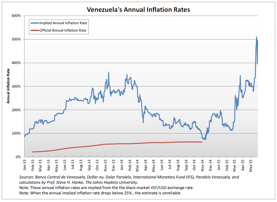
Instead of reporting pie-in-the-sky estimates for future inflation rates in Venezuela, the press should stop worshiping at the IMF’s altar and, instead, stick to reporting current inflation rate. These are updated regularly and are available from the Johns Hopkins-Cato Institute Troubled Currencies Project. The current implied annual inflation rate is 140 percent; while it is currently the world’s highest, it is well below the IMF’s oft-reported forecast of 720 percent.
Comments Off on The IMF’s Feeding the Press Unreliable Inflation Figures on Venezuela
June 2nd, 2016
By Steve Hanke.

Since its high of almost $108/bbl in June of 2014, we have witnessed a stunning collapse in the price of oil. Indeed, in February 2016, a barrel of West Texas Intermediate (WTI) was trading at $26/bbl, a 76 percent plunge from the June 2014 highs. It has since clawed its way back to $49/bbl (May 24th).
What caused the price collapse of this all-important commodity, and where is its price headed? When looking for the causes of price change, nothing beats a sound supply-demand analysis. In the past few years, the United States has played a big role in affecting the world’s oil supply picture. The U.S. was once the world’s largest producer and exporter of oil, and by 1970, its production peaked at 9.6 million barrels per day. Then, a long decline set in, and by 2008, U.S. oil production had been slashed to 50 percent of its peak.
Two new technologies — hydraulic fracturing and horizontal drilling — turned oil and gas production in the U.S. around dramatically in a few short years. By the start of 2015, oil production in the U.S. was 80 percent higher than it had been in 2008. The increase of 4.1 million barrels per day exceeded the comparable increase in every OPEC country but Saudi Arabia.
So, there was a supply surge led by the U.S. In addition, the world was mired in slow growth following the financial crisis of 2008-09. The supply-demand factors finally caught up with the oil market in June 2014, when the market started to roll over. By the time of the 166th OPEC meeting in November 2014, the price of a barrel of WTI had fallen from $108/bbl to $74/bbl, a 31.5 percent plunge. Then, a historic decision was announced at the meeting. In what became known as a “battle for market share,” the members of OPEC stated that they would allow market forces to determine oil prices. On that announcement, oil prices shed another 8 percent in one day.

Since that historic November 2014 OPEC meeting, there has been a great deal of shadow boxing among producers and an endless stream of forecasts about the future course of oil prices. One move that merits particular attention is that of Prince Mohammed bin Salman of Saudi Arabia. With Prince Mohammed’s Vision 2030 plan, it looks like the battle for market share will be the law of the land for the foreseeable future.
To understand the economics behind the Saudi production increase in their quest to maintain market share, we must understand the forces that might cause the Saudis to increase their discount rates.
When it comes to the political instability in the Middle East, the popular view is that increased tensions in the region will reduce oil production. However, economic analysis suggests that political instability and tensions (read: less certain property rights) will work to increase discount rates, which will increase oil production.
Let’s suppose that the real risk-adjusted rate of discount for the Saudis, without any prospect of property expropriation, is 20 percent. Now, consider what would happen to the discount rate if there were a 50-50 chance that a belligerent will overthrow the House of Saud within the next 10 years. In this case, there would be a 6.7 percent chance of an overthrow in any given year. This risk to the Saudis would cause them to compute a new real risk-adjusted rate of discount, with the prospect of having their oil reserves expropriated. In this example, the relevant discount rate would increase to 28.6 percent from 20 percent. This discount rate increase would cause the present value of reserves to decrease dramatically. For example, the present value of $1 in 10 years at 20 percent is $0.16, while it is worth only $0.08 at 28.6 percent. The reduction in the present value of reserves will make increased current production more attractive.
So, the Saudi princes are panicked and pumping oil today — a ‘take the money and run’ strategy — because they know the oil reserves might not be theirs tomorrow. In short, problematic property rights encourage rapid exploitation.
This sets the stage for what is the big question on everyone’s mind: where is the price of oil going from here? To answer that question, we have to have a model — a way of thinking about the problem. In this case, a starting point is Roy W. Jastram’s classic study, The Golden Constant: The English and American Experience 1560-2007. In that work, Jastram finds that gold maintains its purchasing power over long periods of time, with the prices of other commodities adapting to the price of gold. Taking the broad lead from Jastram, my colleague, David Ranson, produced a study in April 2015 in which he used the price of gold as a long-term benchmark for the price of oil. The idea being that, if the price of oil changes dramatically, the oil-gold price ratio will change and move away from its long-term value. Forces will then be set in motion to move supply and demand so that the price of oil changes and the long-term oil-gold price ratio is reestablished. This is nothing more than a reversion to the mean.
We begin our analysis of the current situation by calculating the oil-gold price ratios for each month. For example, as of May 24th, oil was trading at $49.24/bbl and gold was at $1231.10/oz. So, the oil-gold price ratio was 0.040. In June 2014, oil was at $107.26/bbl and gold was at $1314.82/oz, yielding an oil-gold price ratio of 0.082. The ratios for two separate periods are represented in the accompanying histogram — one starting in 1946 and another in 1973 (the post-Bretton Woods period).

Two things stand out in the histogram: the recent oil price collapse was extreme — the February 2016 oil-gold price ratio is way to the left of the distribution, with less than one percent of the distribution to its left. The second observation is that the ratio is slowly reverting to the mean, with a May 2016 ratio approaching 0.04.
But, how long will it take for the ratio to mean revert? My calculations (based on post-1973 data) are that a 50 percent reversion of the ratio will occur in 13.7 months. This translates into a price per barrel of WTI of $60 by March 2017. It is worth nothing that, like Jastram, I find that oil prices have reverted to the long-run price of gold, rather than the price of gold reverting to that of oil. So, the oil-gold price ratio reverts to its mean via changes in the price of oil.
The accompanying chart shows the price projection based on the oil-gold price ratio model. It also shows the historical course of prices. They are doing just what the golden constant predicts: oil prices are moving up.

The report that motivated this line of inquiry is: R. David Ranson. “Tactical Asset Selection: Implications of Cheap Crude Oil for Its Future Price Trajectory,” Cambria, California: HCWE Worldwide Economics, April 17, 2015.
I would also like to acknowledge excellent research by the following research assistants at The Johns Hopkins Institute for Applied Economics, Global Health, and the Study of Business Enterprise: Stephen Johannesson, Pranay Orugunta, Anshul Subramanya, and Jennifer Zheng.
Comments Off on On the Price of Oil