


Posts by StevenHansen:
- Dodd-Frank is touted as the protector of the economy from failures of the Too Big To Fail (TBTF) banks.
- Arrogance and ignorance makes one believe there is a defense possible to prevent damaging failures.
- The way Dodd-Frank is being implemented, it is perpetuating the TBTF banks..
- It is impossible to foresee all possible events;
- It is impossible to foresee and anticipate the chain of events (failure tree) – many / most failures result from a cascade of events which were not anticipated to occur simultaneously or in a failure mode progression.
- It is impossible to foresee all possible events;
- It is impossible to foresee and anticipate the chain of events (failure tree) – many / most failures result from a cascade of events which were not anticipated to occur simultaneously or in a failure mode progression.
- Unadjusted total consumer credit is down 0.1% month-over-month, and the year-over-year growth is 5.9% – relatively unchanged from last month. The consumer credit headlines seem to be overstating significantly the real growth.
- an effort is made to segregate student loans from consumer credit to see the underlying dynamics;
- the growth is expressed as year-over-year change, not one month’s change being projected as an annual change.
- where our analysis expresses the change as month-over-month, month-over-month change is determined by subtracting the previous month’s year-over-year improvement from the current month’s year-over-year improvement.
Perpetualization of the too big to fail banks
May 25th, 2015
By Steven Hansen.

Summary
I am in the middle of the Atlantic on a cruise ship headed to Europe. Having spent 15 years of my life on the high seas and attending shipowners’ conferences, I always take a critical look at cruise ships. Since the birth of this industry almost 50 years ago, the number of passengers on each cruise ship has grown from a few hundred to many thousands.
The ships now are too large to fail. There is not a chance that all passengers can be evacuated in the event of a catastrophic event – so the design of the ships have evolved to both preventing and fighting any foreseen event to minimize the effect to the ship and the passengers. Notice my use of the word “foreseen” as:
Consider now the words of Federal Reserve Chair Yellen in a recent speechtalking about the Too Big To Fail (TBTF) banks;
In the aftermath of the crisis, the Congress tasked the banking regulators with challenging and changing the perception that any financial institution is too big to fail by ensuring that even very large banking organizations can be resolved without harming financial stability. Steps are under way to achieve this objective. In particular, banking organizations are required to prepare “living wills”–plans for their rapid and orderly resolution in the event of insolvency. Regulators are considering requiring that bank holding companies have sufficient total loss-absorbing capacity, including long-term debt, to enable them to be wound down without government support. In addition, the Federal Deposit Insurance Corporation has designed a strategy that it could deploy (known as Single Point of Entry) to resolve a systemically important institution in an orderly manner.
The crisis also revealed that risk management at large, complex financial institutions was insufficient to handle the risks that some firms had taken. Compensation systems all too frequently failed to appropriately account for longer-term risks undertaken by employees. And lax controls in some cases contributed to unethical and illegal behavior by banking organizations and their employees. The Federal Reserve has made improving risk management and internal controls a top priority. For example, the Comprehensive Capital Analysis and Review, which includes the stress tests that I mentioned, also involves an evaluation to ensure firms have a sound process in place for measuring and monitoring the risks they are taking and for matching their capital levels to those risks. Also, supervisors from the Fed and other agencies have pressed firms to improve their internal controls and to make their boards of directors more directly responsible for compensation decisions and employee conduct.
Arrogance and ignorance makes one believe there is a defense possible to prevent damaging failures.
The bold sentence (in the quoted paragraph above) is a discussion of the Single Point of Entry plan of the FDIC where the FDIC in simple terms takes over the bank in a “bankruptcy process” involving either liquidation or emergence from bankruptcy. Most of the logic of this process is the creation of a good company and bad company (where the bad company dies). In effect, the good failed bank likely will remain in existence propagating the too big to fail good bank until the next failure.
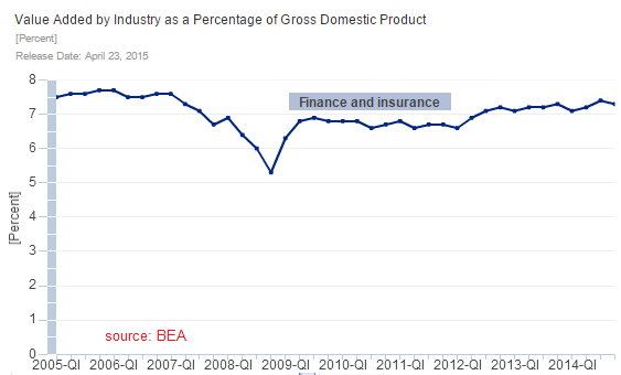
Financial institutions are 7% of the economy, and there are 29 TBTF financial institutions. My operational understanding of the Dodd-Frank Act is that it actually propagates the TBTF banks ad infinitum by appending safety features to a system which really is designed to protect the status quo. Let me say again:
From an organizational design standpoint – big usually is more efficient than little. But the downside is that there is no free market process for banks. Once they become big, they get to remain big forever. Steven Hansen cannot go down and start a bank – the system prevents it – even if Steven Hansen is a good guy and has the finances. Banking has become a good ole boy’s network where the existing players are playing on protected turf.
Usually I have had few words of support for Professor Paul Krugman’s Op-ed’s. However he hit the nail on the head this week saying:
Does this mean that all is well on the financial front? Of course not. Dodd-Frank is much better than nothing, but far from being all we need. And the vampires are still lurking in their coffins, waiting to strike again. But things could be worse.
My weekly economic recap is in my instablog.
Comments Off on Perpetualization of the too big to fail banks
Little Accuracy in Economic Predictions
December 8th, 2013
By Steven Hansen.
I have yet to see a model of the economy which can project future dynamics including accurate projections of productivity, employment, inflation, earnings, peak anything, bubbles, social changes, wars, et al.
Economic models use existing trends and extrapolate to forecast. The surprise in the punch bowl is that economic dynamics are not fixed, and dynamics which align to make an economy flourish in one time period can combine with additional “evil” forces sometime in the future to work against the economy. Take the baby boomers for instance.
Economists saw the acceleration of the economic growth of the late 20th century – and projected this growth into the future. The Great Recession of 2007 might be considered the economic reset from a multi-decade period of high economic growth to a “new normal” of relatively bland economic growth. One of the main contributors to this reset was the baby boomers (a population distortion caused by the end of World War II). The economic argument is that young people starting out in life consume more as they start a family and then work their way to a peak in their career path.
As people age, they begin to see retirement – and as people near retirement, they start to squirrel away assets and money to have more spending power available in retirement. When one retires, less funds are available – so spending is less.
It follows then that increased economic growth can triggered by a slug of young entering the workforce (aka boomers beginning in the late 1960s). The 21st century boomers are not spending like they did at the beginning of their working lives – and the economy is reverting to mean that existed in the late 50s and early 60s after the economic distortions of rebuilding the world healed after World War II.
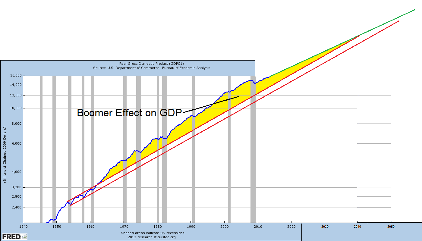
The argument is not as simple as drawing lines on the chart above. I could dazzle with integrations and summations like the economists love to use in their studies. But the truth is that every economic axiom or position requires a set of economic dynamics to maintain defined relationships with each other. There are no definitive tipping points where the wheels could start flying of the economic cart – as the dynamics themselves dissociate or combine with other dynamics to create effects not foreseen in any model.
What I find interesting is the declining birth rate leading into the Great Depression of 1929.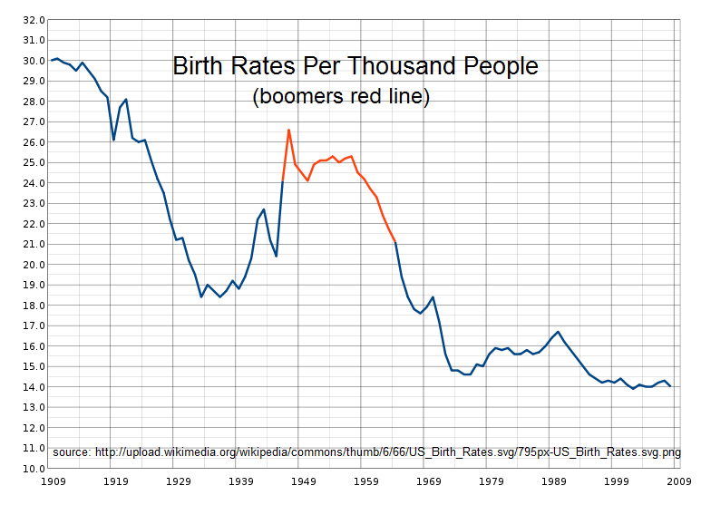
It might be argued that the great birthrate cascade from the beginning of the 20th century to the middle of the 1930s was interrupted by the baby boom and what we have seen in recent decades is simply a continuation to a new bottom in the birth rate. This new bottom has not seen “rescue” and “recovery” such as provided by the baby boom.
An aside: Even a dynamic as obvious as the baby boom with its obvious economic implications can be misinterpreted in a major way. An example of this is the published work of Harry Dent who correctly identified the economic trajectory of the boomers impact. But he ended up on the wrong side of history because the baby boom peak influence that he foresaw for the first decade of the 21st century was swamped by other economic factors that he did not include in his forecasts. His books from 1998-2006 were focused on the booming 2000s with economic problems for the 2010s when the last of the baby boom generation would be transferred into the above 55 age group. He didn’t see the greater forces overwhelming his assumed dominance of demographics, namely the bursting dot.com bubble followed by the housing bubble and the Great Financial Crisis of 2008.
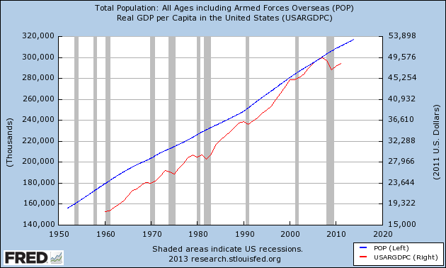
The population does have a lot to do with the economy. It is curious that although the USA birthrate is still declining – the overall population growth is relatively constant. This is influenced by immigration but longevity is also an important factor. People are living longer – and the life span increase produces a swelling of the population in a stage in life of lower consumption (except for health care expenses). Does it make anyone wonder about longer lifespans being one of the (major?) dynamics producing runaway per capita healthcare costs?
But as share of GDP devoted to health care increases, doesn’t that merely represent a shift in buying preferences? Doesn’t that simply mean that the health care sector becomes a “winner” in the economy as other sectors become “losers”? Isn’t that simply the result of the market forces at which alter we worship?
Of course, many will argue that the market forces involved in health care are not really effective and the efficiency of delivery of that product has been distorted by removal of the basic participants (doctors and patients) from the “marketplace”, which has become dominated by government programs and corporate compensation programs. These have removed effective “control” of the market to insurance companies and government subsidy forces.
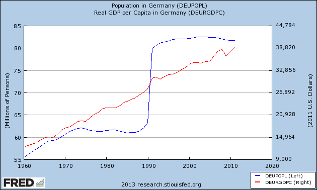
And when you become convinced that there is some correlation between population growth / demographics and the economy – you can stare at the below graph for Germany.
Almost any opinion can be argued as true (or false) in economics. This clearly reflects the primitive level of understanding of the complex dynamics of macroeconomic interactions.
My usual weekend economic wrap is in my instablog.
May 2013 Consumer Credit Growth of 8.25% Is Imaginary
July 9th, 2013
By Steven Hansen.
The headline said:
Consumer credit increased at an annual rate of 8-1/4 percent in May. Revolving credit increased at an annual rate of 9-1/4 percent, while nonrevolving credit increased at an annual rate of 8 percent.
Econintersect takeaway from the data:

Unadjusted Consumer Credit Outstanding
| Month- over- Month Growth | Year- over- Year Growth | Month- over- Month Growth without Student Loans | Year- over- Year Growth without Student Loans | |
| Total | -0.1% | 5.9% | 0.1% | 2.5% |
| Revolving | -0.1% | 1.2% | n/a | n/a |
| Non- Revolving | -0.1% | 8.0% | -1.2% | 5.5% |
Both May and April 2013 were one of the lowest student loan growth months seen since mid 2012 (see red line on the Flow of Funds into Consumer Credit graph below). The market expected consumer credit to expand $10.5 to $13.2 billion versus the seasonally adjusted expansion of $19.6 billion reported.
Note that this consumer credit data series does not include mortgages.
The Econintersect analysis is different than the Fed’s as follows:
The commonality between the Fed and Econintersect analysis is that consumer credit is now expanding whether one considers student loans or not. Econintersect does not believe the seasonal adjustment methods used in the headlines are accurately conveying the situation for a variety of reasons.
This month student loans accounted for 20% of the total loans issued (note this flows into credit – while the headlines and this analysis showcases the loan amounts outstanding). Since the Great Recession, much of the increase in consumer credit is from student loans (A good background article was written by Frederick Sheehan). Note: If any reader of this post has issues with payments or default, some of your options available are addressed in this NYT article. The following graph shows the flow into consumer credit (including student loans) against the flow into student loans alone.
Flow of Funds into Consumer Credit – Total Consumer Credit (blue line) vs Student Loans (red line)
Another way to view the effects of student loans on consumer credit is to view the year-over-year growth in $ billions of student loans as a percent of total consumer credit (including student loans). In short, student loans accounted for all consumer credit growth from 2009 to late 2011. Currently, the trend line rate of growth (blue line in graph below) is consistent with the pre-2007 rate of growth – however, the rate of growth seems to have slowed in recent months.
Year-over-Year Growth in $ Billions – Total Consumer Credit (blue line) vs Student Loans (red line)
Consider that student loans make up a large portion of assets of the Federal Government [from Econintersect contributor Doug Short]

And one final look at total consumer credit and the effect of student loans. The graph below removes student loans from total consumer credit outstanding.
Total Consumer Credit Outstanding – Total Consumer Credit (blue line) vs Total Consumer Credit without Student Loans (red line)
Econintersect spends time on this generally ignored data series because the USA is a consumer driven economy. One New Normal phenomenon has been the consumer shift from a credit towards an electronic payment (current account debit) society – a quantum shift which changes the amount of consumption. Watching consumer credit provides confirmation that this New Normal shift continues.
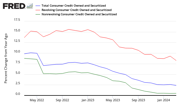
Year-over-Year Growth of Consumer Credit – Total (blue line), Revolving Credit (red line), and Non-Revolving (green line which includes student loans)
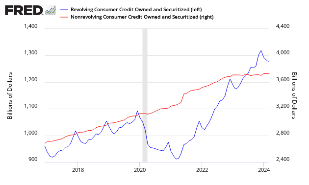
The Federal Reserve reports credit divided between revolving and non-revolving. The majority of revolving credit is from credit cards, while non-revolving credit includes automobile loans, student loans, and all other loans not included in revolving credit, such as loans for mobile homes, boats, trailers, or vacations.
Comparison Revolving Credit Total (blue line) to Non-Revolving Credit Total (red line)
Other Consumer Credit Data from Outside this Report:
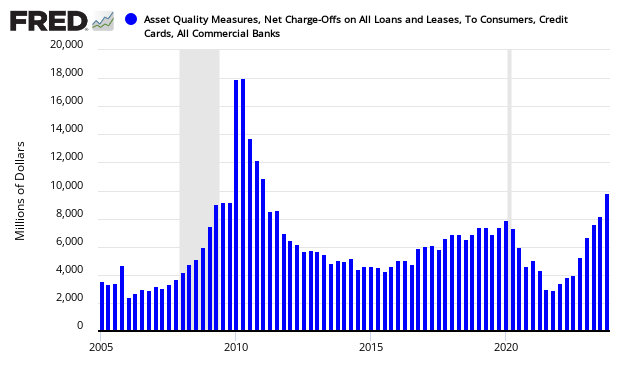
The question remains on the rate of write-downs of consumer loans. The following graph addresses this question:
Net Charge-Offs on Consumer Credit
The next graph addresses the question of loan losses by the banks:
Bank Net Loan Losses – Percent of Total Loans

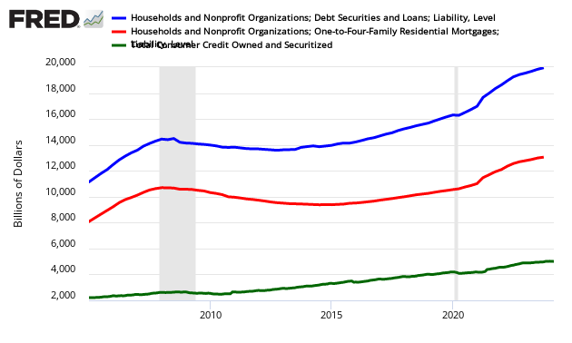
This consumer credit release does not include mortgages. Here is what total household debt looks like. Please note that the mortgage data is not as current as the consumer credit data in this post.
Total Household Debt (includes mortgages blue line), mortgages (red line), and Consumer Credit talked about in this post (green line)
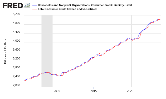
And just to make sure the data in the consumer credit report migrates to other reports, here is a graph from Z.1 Flow of Funds.
Total Consumer Credit Outstanding from Flow of Funds Z.1
Caveats on the Use of Consumer Credit
This data series does not include mortgages, and is not inflation adjusted. This whole series has undergone a major revision with the April 2012 Press Release:
The Federal Reserve Board on Monday announced that it has restructured the G.19 statistical release, Consumer Credit, to reflect regulatory filing changes for U.S.-chartered depository institutions and, in addition to the data currently reported on level of credit outstanding, the release will now report data on the flow of credit. The revised data will be made available with the release of the April report on Thursday, June 7.
Savings institutions now file the same regulatory report as U.S.-chartered commercial banks. The U.S.-chartered commercial banks sector and the savings institution sector, which were previously shown separately, have been combined into a new sector called depository institutions. The previously published series for U.S.-chartered commercial banks and savings institutions will continue to be available as separate series in the Federal Reserve’s Data Download Program (DDP).
The new flow data represent changes in the level of credit due to economic and financial activity, rather than breaks in the data series due to changes in methodology, source data, and other technical aspects of the estimation that affect the level of credit. Access to flow data allows users to calculate a growth rate for consumer credit that excludes such breaks.
These changes will be accompanied by revisions to the estimates of outstanding consumer credit back to January 2006 and reflect improvements in methodology and a comprehensive review of the source data.
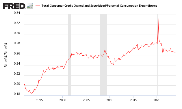
The graph below shows consumer credit outstanding (this data series does not include mortgages) is slightly less than 23% of annualized consumer spending – down from a high of over 26% in the 2000s, but still above the averages before the mid 1990s.
Ratio of Total Consumer Loans Outstanding to Consumer Spending
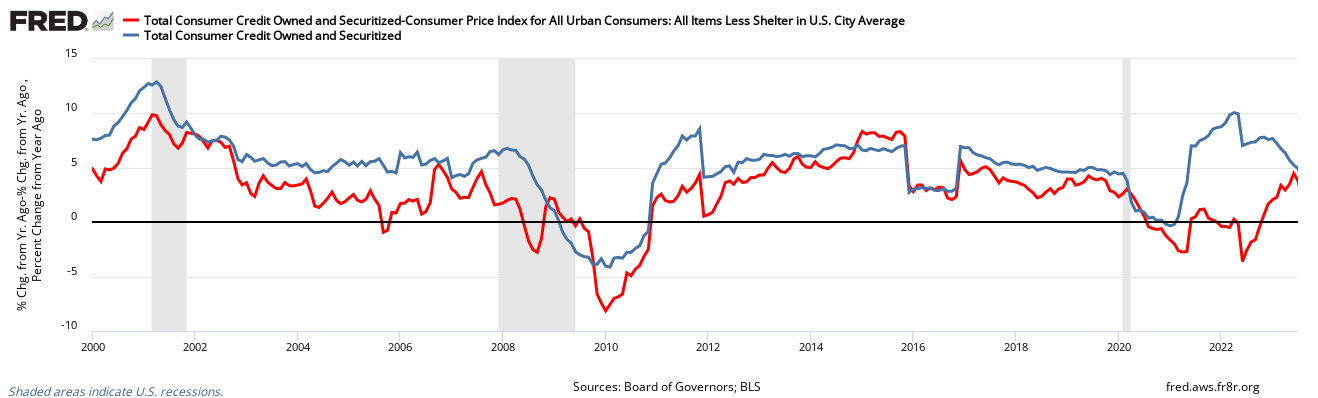
To get a feel of inflation adjusted consumer credit, the following graph is inflation adjusted consumer credit using the CPI-U (less shelter) – this is expressing consumer credit in 1982 dollars. It is evident on an inflation adjusted basis, consumer credit is beginning to grow.
Inflation Adjusted Consumer Credit
Also, an interesting graphic showing the consumer’s ratio of liquid assets to total liabilities – I am not sure what can be implied except that it is evident that de-leveraging is well underway. As the average Joe Sixpack has little savings or other liquid assets, we can assume this graphic is dominated by the upper half of the USA population.
Ratio of Consumer Liquid Assets to Total Consumer Liabilities

Econintersect believes consumer credit levels are now in its historical channel from the 1990′s.
Related Articles