


When it comes to effective communication, diagrams reign king. A well-constructed diagram can make complex topics digestible for even the most layman of audiences. However, diagrams are often not as effective as they could be. Ineffective diagrams lead to confusion and misunderstanding. Here are 10 tips to help you make your diagrams more effective:
1. Clear Objectives
What do you want your diagram to accomplish? What is its objective? Knowing the objective of your diagram is essential in knowing how best to steer it and maintain a coherent flow throughout. Are you trying to illustrate a sequence, whether linear or branching? Are you trying to highlight relationships between different components or concepts? What are your key messages? Knowing what you need your diagram to get across will help you craft it in the most effective manner possible.
2. Reference Other Diagram Types
When constructing or presenting a particular type of diagram, take some time to survey similar diagrams that have been done before and learn from them. By understanding the best practices employed by other diagrams of the same type, you will understand which pitfalls to avoid and which conventions best facilitate understanding.
3. Highlight Your Main Themes and Ideas
When designing your diagram, know what the main points are. These are your main themes. When possible, try to make the most important elements of your diagram larger or somehow stand out from the rest in order to give them greater emphasis.
4. Simplify and Organize
Look for ways you can simplify information and organize it into a coherent structure that is easy for viewers to follow. Strive to make your diagram as intuitive as possible.
5. Use a Suitable Structure
Have you decided on the best structure for your intended flow? Does it facilitate ease of understanding? One way to think about structure is as a hierarchy. The most important ideas should be the largest or boldest elements with supporting details becoming gradually smaller and less bold, giving way to the least important details. Another aspect of the structure is relationships between components, including connections and relative positioning. Establish these relationships early on and be consistent throughout the diagram to minimize confusion.
6. Use Consistent Conventions for Different Types of Diagrams
Consistency is key when it comes to diagram design. By adhering to a set of conventions for different types of diagrams, you make it easier for viewers to understand and compare them. This also helps to avoid confusion, as viewers will be able to quickly orient themselves to the conventions used in the diagram.
When creating a new type of diagram, take some time to research and learn from existing diagrams of that type. There is much to be learned from the best practices employed by others in your field.
7. Use Shapes, Lines, and Other Elements to Create Meaningful Differentiations
Conventionalized shape differences can be very useful when trying to convey a specific type of information. Think about what these shapes might mean in your diagram and how you could use them effectively. For example, a diamond shape might denote a decision point.
8. Remember Your Audience
Keep in mind who your target audience is and their level of understanding when creating a diagram for them. Consider the knowledge they will have about the topic beforehand and how best to compensate for that with your diagram. Also, consider what previous diagrams from that same field or by other authors may have been helpful to them.
9. Use Colors, Texts, and Other Visual Elements Carefully
The colors you use in a diagram can have significant effects on the way it is received by viewers. The colors you choose will communicate different things depending on their cultural associations and personal interpretations. For example, red commonly connotes danger or negative affect. It is usually best to avoid using this color in diagrams intended for global audiences. Also, text can be very important contextual information but use it sparingly so as not to overcrowd the diagram and make its elements hard to discern.
10. Avoid Clichés
Clichés are commonly-used images or figures of speech that have widely become overused. Although it may be tempting to use them for their convenience or immediately recognizable quality, they can result in an unoriginal or even annoying diagram. Be careful not to fall into this trap.
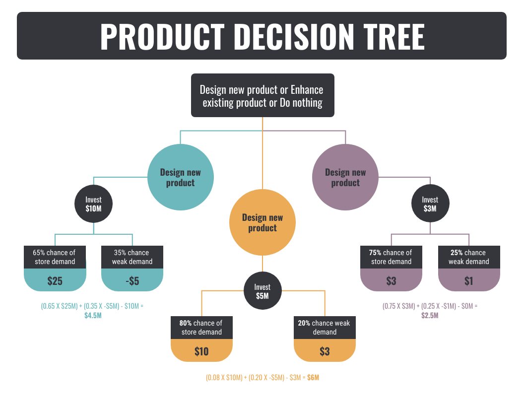
To easily create diagrams, use Venngage — a free infographic maker that offers a wide range of diagram templates for everyone. Here are some diagram examples from their website!

Venngage

Venngage
Venngage
Designing a diagram is much like telling a story. The difference is that your story takes place in two dimensions, not three, and it contains only visual elements rather than words. But you are still trying to convey ideas in an effective way without confusing or overwhelming viewers.
Diagrams are useful communication tools when they accurately convey the intended message. Adhering to the above 10 guidelines, you can take your diagrams from amateurish to professional and make yourself an invaluable asset to any team. If you’re having a hard time making one from scratch, then use an online diagram maker like Venngage. To start, click here.